
Best Real Estate Landing Page Design: Examples and Checklist
What a high-converting real estate landing page needs: one goal, a clear offer, a short form, honest project imagery, trust signals and mobile testing, plus a checklist to review your page before you run ads.

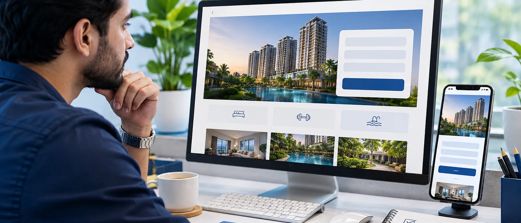
Key takeaways
- A real estate landing page should have one goal. Ask for one action, such as a site visit booking, a brochure request or a callback, and remove the rest of the navigation.
- Keep the form short. Name, phone number and one project question is often enough to start a conversation.
- Use honest project imagery and specific details: location, unit types, price band if officially shared, and the next step.
- Test the page on a phone before you spend on ads, because most ad clicks arrive on mobile.
A real estate ad can be well targeted and well priced and still fail, because the page it sends people to asks for too much, says too little or does not load well on a phone. The landing page is where the enquiry is either made or lost. This guide gives you a design checklist, shows the patterns that work, and explains how to review your page before you spend.
The best real estate landing page has one goal, a headline that names the project or offer, a short form, honest project details and imagery, trust signals such as registration information and real contact options, and a layout that works on a phone. Review it against the checklist below, test it on a mobile device, and change one element at a time.
The checklist
| Element | What to check |
|---|---|
| One goal | One main action only, such as a site visit booking, a brochure request or a callback |
| Headline | Names the project, location or offer in the first line, in the words your buyer searched for |
| Offer | Says what the visitor gets: a visit, a brochure, a price call, a walkthrough. Avoid vague promises |
| Form | Short, with a clear label on each field and a button that says what happens next |
| Project details | Location, unit types, possession timeline and price band only if officially shared, with the date |
| Images | Real project or site photos you have rights to use. No developer logos or copied brochure images |
| Trust signals | Registration details, office address, named contact person, and a clear privacy line near the form |
| Mobile layout | Form and button visible without endless scrolling, text readable, and no pop-ups that block the page |
| Speed | Images compressed and the page loads quickly on a mobile connection |
| Follow-up | Every submission reaches your CRM or inbox, and someone is assigned to call back |
Patterns that work for real estate
- One goal per page. A navigation bar and a row of links pull visitors away from the form. Remove them on paid landing pages.
- A lead magnet. A brochure, a floor plan request, a price call or a neighbourhood guide gives people a reason to share their details.
- A short form. Three fields often work better than eight. Ask the rest on the callback.
- Strong imagery. Photography carries luxury and mid-segment projects. Use full-width photos with a clear headline on top, and keep the text readable.
- Specific trust. A named contact, a visible registration number where it applies, and a real address do more than generic badges.
Three page layouts to learn from
These are common layouts, described so you can sketch your own. They are examples of structure, not claims about results.
One project, one action A full-width project photo, the project name and location in the headline, three or four key facts (unit types, possession date, price band if officially shared), a short form on the first screen and a repeat of the button after the details.
For warm traffic and retargeting A short line on what the visit includes (walkthrough, pickup if offered), a date and time picker or a choice of two slots, and a WhatsApp button for people who prefer to chat. Very little else on the page.
For early-stage researchers A preview of the brochure, a clear promise of what they get after submitting, a three-field form and a plain privacy line. Works well for people who are not ready to visit yet.
When you browse other pages for ideas, ask for each one: what is the single goal, how many fields are in the form, and what does the headline promise? Vendor roundups are often written by the vendors themselves, so use them as inspiration and not as proof that a design converts. Copy the structure, not the photos or wording.
What strong pages do, from the roundups
Roundups of real estate landing pages (Wishpond, SeedProd, Landingi, B12 and others) keep returning to the same few patterns. Most featured pages are from the US and UK, so use them for structure, not for copy.
- One focused action. Redfin's home valuation page is often cited for skipping listing photos and menus so the visitor does one thing.
- A short form. A project page called Regent's Crescent is cited for a three-field form and a button that stands out.
- Trust up front. Pages such as Mayer Realty Group are praised for a trustworthy, uncluttered look, and team pages like Keri Shull's for a single clear call to action.
- Urgency with a reason. Pages that give a real reason to act now, such as a limited launch window, convert better than vague "hurry" banners.
A mobile layout for Indian buyers
- Top: project name and area, one real photo, a one-line promise, and a click-to-call button.
- First screen: a 3-field form (name, mobile number, preferred time) with a button like "Get brochure and price on WhatsApp".
- Next: four key facts (unit types, possession date, location, price band if officially shared), then the form button again.
- Trust block: RERA registration number where it applies, builder name, address and a named contact.
- Language: offer a Hindi or regional language version when your ads run in that language.
- After hours: many enquiries arrive in the evening and late at night, so send an instant WhatsApp acknowledgement and promise a callback time.
How to test your page before you spend
- Open it on your own phone on mobile data, not only on Wi-Fi. Time how long the headline and form take to appear.
- Submit a test enquiry and check that it reaches your CRM, your inbox or your WhatsApp, and that the thank-you message is correct.
- Ask a colleague who has not seen the project to tell you the goal of the page in one sentence after 10 seconds.
- After launch, change one thing at a time, such as the headline or the form length, and give each version enough traffic before you decide.
Once the page is live, the quality of the leads depends on your targeting and follow-up too. See our guides on why real estate ads bring junk leads and WhatsApp follow-up scripts.
Common landing page mistakes
Several goals on one page. Visitors cannot tell what to do, so they do nothing.
Long forms on first contact. Each extra field costs enquiries.
Unverified claims. Prices, offers and returns need an official source and a date, or they should not be on the page.
No follow-up plan. A good page cannot save a lead nobody calls.
Frequently asked questions
What makes a good real estate landing page?
A good page has one clear goal, a headline that names the project or offer, a short form, specific details buyers care about, trust signals such as registration details and real contact information, and a page that loads quickly on a phone.
How many fields should a real estate landing page form have?
Start with the fewest fields that let your team call back. For most projects that is name, phone number and one question about the buyer need. Add more fields only if your sales team uses them in the first conversation.
Should a landing page have a navigation menu?
For paid traffic, usually not. A menu gives visitors many places to go, which lowers the chance they take the one action you want. Keep a logo and a single contact option.
What images work best on a real estate landing page?
Use real photos of the project, site progress or the location where you have rights to use them. Do not use developer logos or brochure images without permission, and do not present AI-generated scenes as the actual project.
Do I need a separate landing page for each ad?
Not always, but each ad group should send people to a page that matches its promise. A page for a specific project and audience usually converts better than one generic page for everything.
How do I know if my landing page is working?
Track page visits, form starts, form submissions, calls and WhatsApp messages, and the share that become qualified leads and site visits. Change one element at a time and give each test enough traffic before you decide.
Want a landing page built for your project?
Grand Business Media designs and tests landing pages for real estate projects, connected to ads, WhatsApp follow-up and your CRM. If you want a page reviewed against this checklist, talk to us.
More from the GBM blog

Target Audience for Real Estate Facebook Ads in India
Who to target in real estate Facebook ads in India: buyer segments by budget and project type, location and interest choices, the housing ad rules to check, and a simple way to test audiences.

Best CRM for Real Estate in India: 8 Options Compared (2026)
A side by side comparison of the CRMs Indian brokers, agents and developers actually shortlist: Sell.Do, LeadSquared, Zoho CRM, Salesforce, TeleCRM, Kylas, Buildesk and general tools such as Bitrix24 and HubSpot, with features, best fit, reported pricing and a way to choose.
Reading is step one. Let’s build your buyer pipeline.
Book a free 30-minute strategy session and we’ll map exactly how these systems would work for your projects.
Gurgaon · Dubai · Limited client seats each year